

Cpgconnect // Vol. 18: $30M Beverages, Sprouts Nationwide, and the Rise of Better-for-You Seasonals

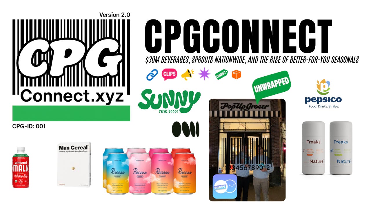
From funding rounds and national retail rollouts to seasonal favorites making their return. This issue highlights brands pushing boundaries in both product innovation and brand strategy: Recess raises $30M to fuel growth, Sunny Fine Foods lands nationwide in Sprouts, and PepsiCo unveils a long-awaited corporate refresh.
Let’s dive into it…But first…
CPG Connect Brand Partner Form
One of the best parts of this year has been connecting with so many incredible people across the CPG space. It really is the best industry to be in.
Over time, I’ve had a lot of founders and operators reach out about potential partnerships, from agencies and PR teams to investors, tech platforms, Shopify apps, and other service providers looking to collaborate with growing brands. To make this easier and more intentional, I’ve put together a quick form to help collect brand info and identify opportunities to connect people who can help each other scale.
This is exactly what CPG Connect was built for, bringing together good people in the space, sharing resources, and creating opportunities that help everyone grow.
Events:
Cool opportunity for any health and wellness brands in the community: a local gym is hosting a Grand Opening event on November 8th, and they’re looking to spotlight food and beverage brands focused on health, fitness, and performance.
We’re expecting around 200–300 attendees, including influencers, local founders, and partner brands, making it a great chance to get in front of an engaged, wellness-minded audience.
If you’d like to get involved, reach out! This could be an awesome way to activate your brand locally ahead of the holidays.
RSVP - Crushing BFCM With Email & SMS (Slc) 10/30
RSVP - BUILDING YOUR CORE TEAM (Nyc) 11/5
RSVP - Basketball Meetup (Downtown Brooklyn) 11/16
RSVP - BeaUtahful Brunch @ Thread HQ 11/22 (Slc)
RSVP - Smarterships San Francisco Happy Hour 11/5 (Sf)
RSVP - NYC Commerce Club November Mixer 11/12 (Nyc)
RSVP - Founders Basketball New York City 11/12 (Nyc)
RSVP - holiday happy hour + ugly sweater 12/10 (Nyc)
Brand Spotlight: LiftStack brings transparency to the protein snack market
LiftStack, founded by Kullen Jahnke, is building a discovery and rating platform for the fast-growing world of protein and functional snacks. The platform aggregates reviews, scores, and nutrition data to help consumers compare products side by side, creating much-needed clarity in a category often dominated by bold marketing claims.
Currently in early access, LiftStack invites users to join a waitlist to explore its expanding library of protein snacks, complete with personalized recommendations and transparent ratings. For brands, it offers a new way to be discovered by health and performance-focused consumers who value quality and nutritional integrity.
As the protein category continues to expand across bars, cereals, and beverages, LiftStack aims to serve as the trusted source for snack discovery, bridging the gap between consumer curiosity and credible insight.
Tech Spotlight: Rho streamlines finance for high-growth founders
Rho is redefining how founders manage money with an all-in-one finance platform built for modern, high-growth companies. Founders get fee-free business banking, high-yield treasury with no lock-ins, market-leading cash back (up to 2%), no account minimums, and a dedicated account manager, all in one seamless platform.
For Cpgconnect readers, if your average checking balance is $20K+, you’ll get a $1,600 bonus 60 days after you move your business banking over to Rho.
If you’re looking to upgrade your finance stack before year-end, this one’s worth checking out: Sign up here
Unwrapped: Jack & Jacob w/ Byte’m Brownie Bites
What Inspired Us to Start Brownii Bytes
We met freshman year of college, became best friends, and bonded over food, cooking dinners with our roommates, trying new spots, and constantly talking about what we’d build one day. We didn’t know it yet, but food was always the common thread.
After graduation, we went different directions, one of us into tech sales, the other into law school, but we kept brainstorming ideas. One day, the idea hit: take my mom’s brownie recipe and turn it into something bigger. It was nostalgic, rich, and fudgy.The kind of brownie everyone remembers growing up with but no one could actually buy off the shelf.
That was the moment. We wanted to bring that homemade feeling to the grocery aisle, something that reminded people of home but was convenient, accessible, and real.
How It All Started
When we say we started from the ground up, we mean it. The first batches were baked in my mom’s kitchen. We bought blank bags from Vistaprint, printed our logo, and hand-packed brownies ourselves.
Our first “launch” was at a family event in D.C. People couldn’t believe we’d made them, they thought we were joking when we said this was our brand. That reaction told us everything we needed to know.
From there, it was pure hustle. We designed every detail ourselves, from packaging to wordmarks, flying back and forth between cities while balancing jobs and classes. We bootstrapped everything and learned every lesson the hard way.
We didn’t cut corners on what mattered, quality and safety. We partnered with a commercialization house to scale production properly and make sure every bite was as good as the first one from my mom’s oven.
What Makes Brownii Bytes Stand Out
There’s a reason we say we’re not reinventing the brownie, we’re perfecting it.
We lead with flavor. Not macros, not buzzwords. Real butter, premium vanilla, and that chewy, fudgy texture that tastes homemade. Our goal isn’t to make “healthy brownies.” It’s to make great brownies.
We’re inspired by the best, brands like Tate’s for their homemade feel, Ben & Jerry’s for texture and fun, and Crumbl for innovation. But what makes Brownii Bytes unique is how it ties those ideas back to something emotional, something nostalgic and familiar.
We’re not afraid to say we’re a grocery store brownie. We embrace it. We want you to grab it, take a bite, and instantly think, “This tastes like home.”
The Biggest Challenge So Far
Scaling. Hands down.
Going from baking at home to producing thousands of brownies a day changes everything. Recipes have to be reformulated, equipment has to be tested, and costs get real.
We’ve spent months working through machinery upgrades, testing automation, and figuring out how to scale fast without losing quality. It’s not easy, we’ve hit roadblocks, run out of cash, and had to find creative ways to keep going.
But staying scrappy has kept us grounded. Every decision, every investment, every new store comes with the same level of care we had when we started. That’s the hardest part and the part we’ll never compromise on.
How We’re Approaching Growth
We’re in about 500 stores right now and growing fast. The goal by the end of next year is 1,500.
Our growth strategy is simple: focus on the product and let it do the talking. We’re not pouring money into ads, we’re building relationships, refining operations, and improving margins so we can scale sustainably.
Everything comes back to three pillars:
Flavor. Accessibility. Community.
We’re constantly dropping new flavors, expanding where people can find us, and building a brand that people actually connect with. Whether it’s in the CPG space or at the shelf, we want people to feel something when they see Brownii Bytes.
Where We’ll Be a Year From Now
A year from now, we want Brownii Bytes to be the brownie brand you think of when you walk down the aisle.
We want people to crave it, recognize it, and feel something when they open the package. Not because of a marketing claim, but because it actually tastes that good.
We’re building this brand brick by brick, and we’re just getting started.
NEWS:
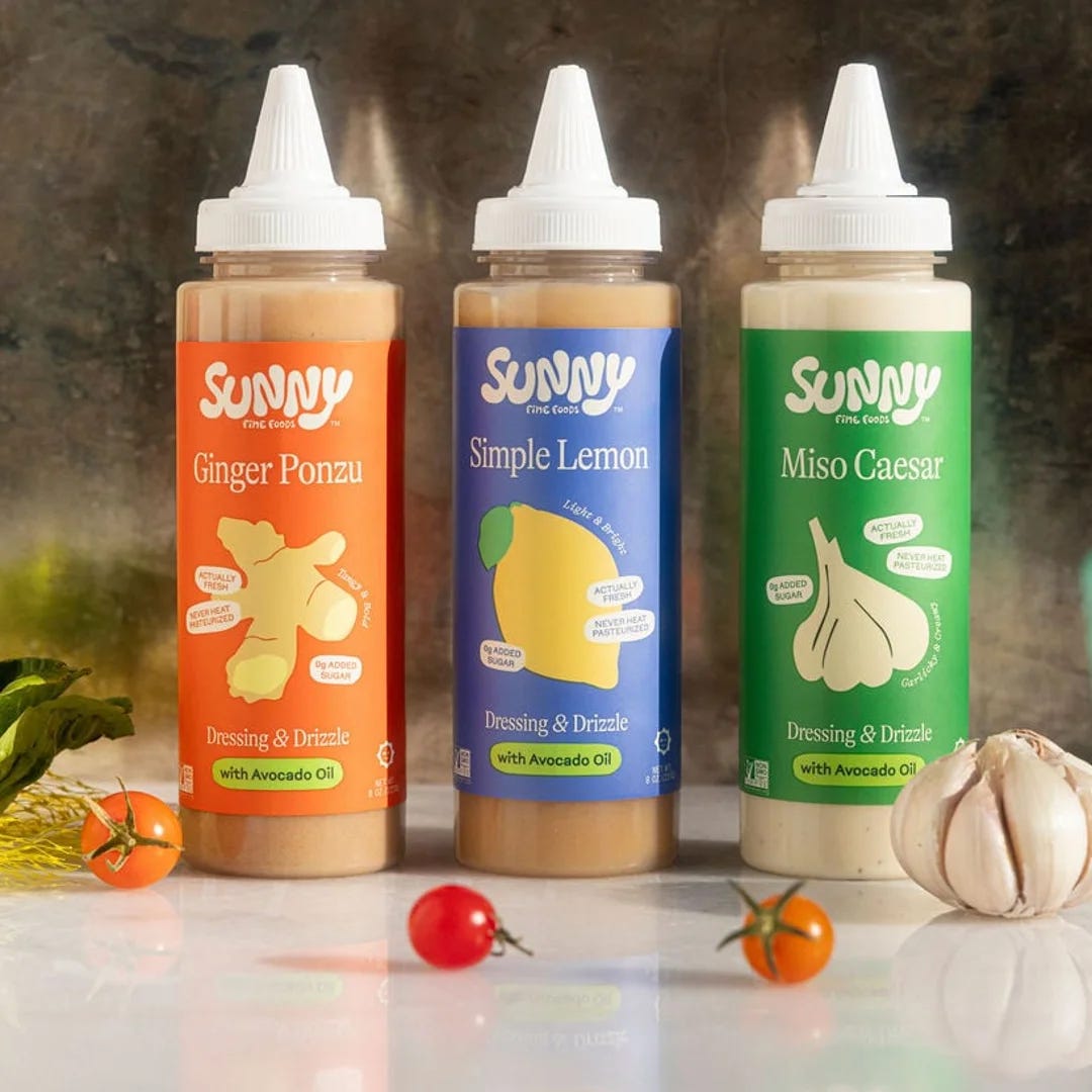
Sunny Fine Foods expands nationwide with Sprouts Farmers Market rollout
Sunny Fine Foods, the clean-label dressing and drizzle brand bringing chef-level flavor to the fridge aisle, just hit a major milestone: nationwide distribution across every Sprouts Farmers Market in the U.S.
Built on a belief that real food deserves real ingredients, Sunny’s lineup features bold, fresh flavors like Ginger Ponzu, Miso Caesar, Simple Lemon and their newest launch, Scallion Ranch, all made with avocado oil and thoughtful sourcing.
This rollout marks a huge step for the brand as it continues redefining the refrigerated dressing category with vibrant flavors, fresh herbs, and restaurant-quality formulas that prove clean eating doesn’t have to be boring.
Backed by co-founder & CEO Matt Kramer and a small but mighty team, Sunny is quickly becoming a staple for shoppers who care about ingredient integrity and serious flavor.
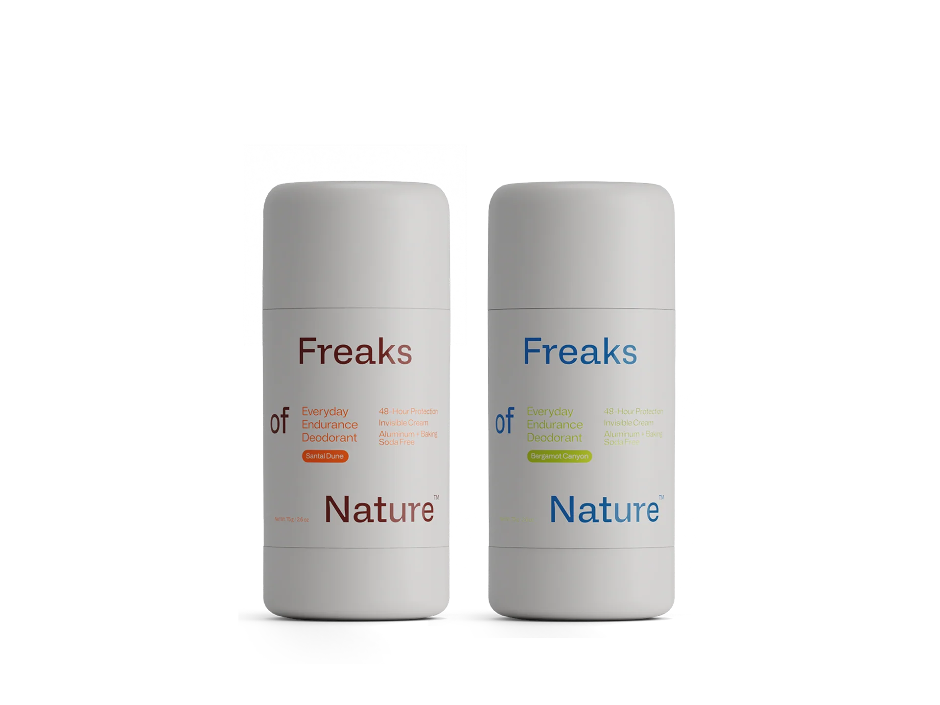
Freaks of Nature expands into personal care with the launch of its Everyday Endurance Deodorant line
Freaks of Nature, the wellness brand co-founded by world champion surfer Kelly Slater and venture studio Squared Circles in 2024, has officially entered the personal care category with its new Everyday Endurance Deodorant.
The line debuts in two scents, Santal Dune and Bergamot Canyon, formulated for 48-hour odor protection without aluminum or baking soda. Each deodorant is designed to support the skin’s natural microbiome while delivering a clean, long-lasting fragrance experience.
This launch marks a natural evolution for Freaks of Nature, known for its high-performance and minimalist approach to self-care. By expanding from skincare into deodorant, the brand continues its mission to build a functional wellness system for active, health-conscious consumers seeking elevated essentials for everyday performance.
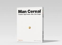
Man Cereal officially launches with a creatine and protein-powered breakfast line
Man Cereal has entered the functional food space with a new take on breakfast, a high-protein and creatine-infused cereal designed for fitness-minded consumers.
The brand’s debut lineup includes three flavors: Salted Fudge, Maple Bacon, and Fruity. Each variety combines around 15 grams of protein with 2.5 grams of creatine monohydrate per serving, delivering a performance-focused twist on a nostalgic staple.
Positioned at the intersection of breakfast and sports nutrition, Man Cereal is part of a growing wave of functional CPG brands redefining what “better for you” means. With bold flavors and a nutrition-first formula, the brand is betting that cereal can be both indulgent and effective, a post-workout snack as much as a morning ritual.
PepsiCo unveils new corporate brand identity after 25 years
PepsiCo has revealed a new global corporate identity that will begin rolling out on packaging and branded materials in early 2026, marking the first major redesign of its corporate logo in more than two decades.
The new identity features a lowercase wordmark and an abstract “P” symbol built from layered shapes representing water, grains, and a smile — visual cues meant to reflect PepsiCo’s dual focus on food and beverage, sustainability, and human connection. The update also introduces a new tagline, Food. Drinks. Smiles., signaling a shift toward a more unified brand presence across its diverse portfolio.
The rebrand reflects PepsiCo’s move toward a “branded house” strategy, elevating the corporate name alongside its flagship products to strengthen recognition beyond Pepsi. After 25 years with the previous design, this refreshed look represents a modern and more expressive vision for one of the world’s largest consumer goods companies as it continues to evolve for the next era of growth.
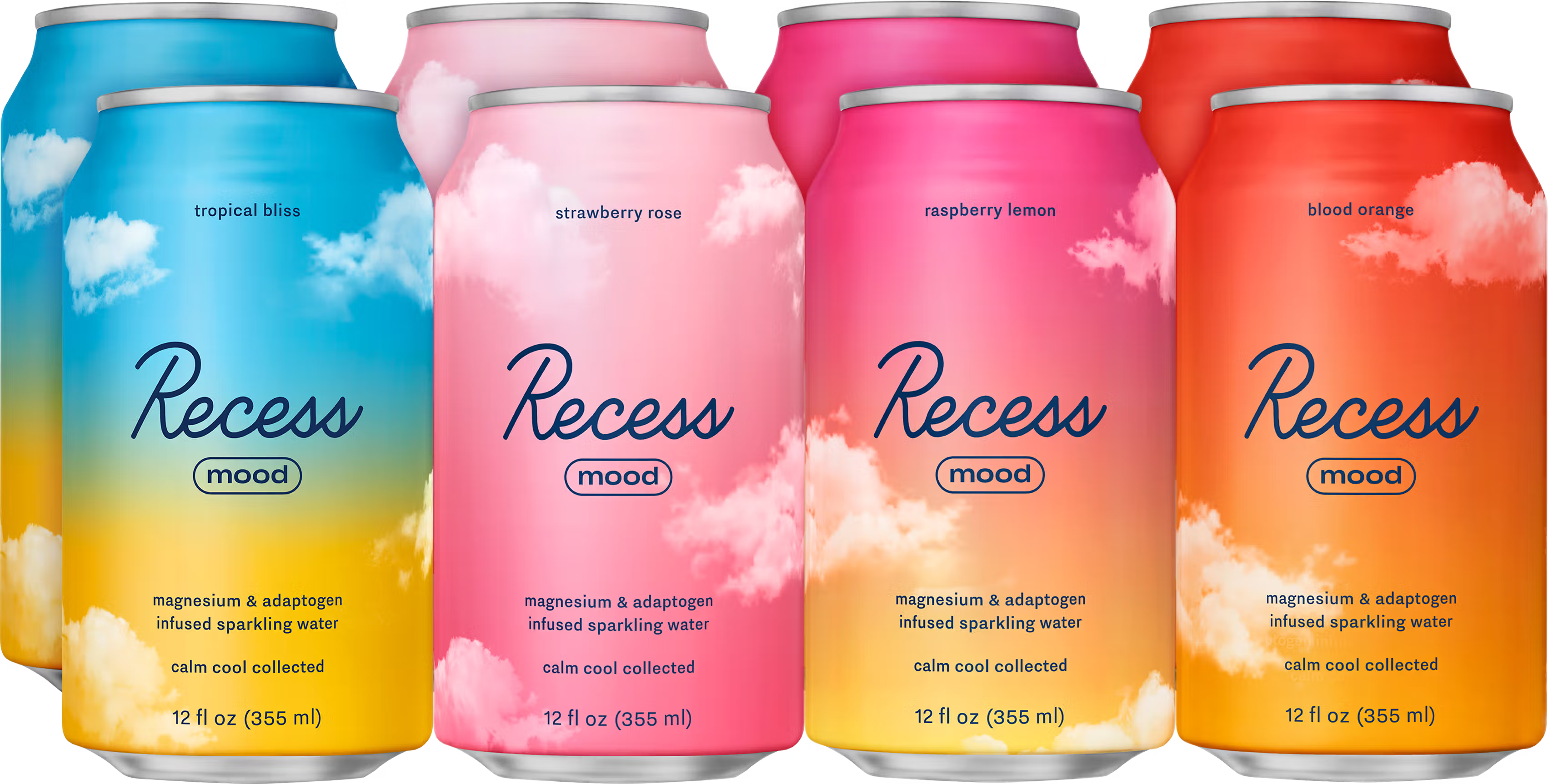
Recess closes $30M Series B led by CAVU Consumer Partners
Recess, the functional beverage brand founded in 2018 by Ben Witte, has raised $30 million in a Series B round led by CAVU Consumer Partners, with participation from Rocana, Midnight Ventures, Torch Capital, and Doehler Ventures.
CAVU first invested in Recess in 2021, the same year it backed Poppi, signaling its continued belief in the brand’s long-term potential within the functional beverage space. Originally launched as a CBD-infused sparkling water brand, Recess has since evolved into a broader platform spanning three beverage lines and a range of drink mixes that focus on mood, calm, and daily wellness.
Alongside the funding, Recess announced that Kyle Thomas, former CRO and CCO at Nutrabolt (C4 Energy), has joined as President and Co-CEO. The hire marks a pivotal moment for the brand as it prepares for its next phase of growth, scaling distribution and expanding its footprint across the fast-growing functional and alcohol-alternative beverage categories.
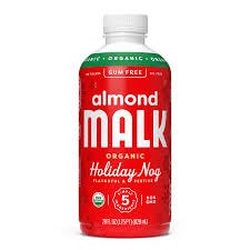
MALK Holiday Nog Almond Milk returns as seasonal limited-edition drop
MALK, the clean-label plant-milk brand known for short ingredient lists and minimalist messaging, has brought back its Holiday Nog flavor for the 2025 season. The launch was featured in BevNET’s “New Products” roundup on October 24, 2025.
Positioned as a festive, better-for-you take on classic eggnog, the blend includes just five ingredients: filtered water, organic almonds, organic maple syrup, organic nutmeg extract, and Himalayan pink salt. It retails for approximately $6.99 on MALK’s website and appears under the brand’s “Seasonal” collection.
From a category perspective, Holiday Nog reflects the continued success of limited-edition, occasion-driven launches within the plant-based milk space. MALK’s clean-label promise — “No gums, no oils, no fillers” — remains central to its appeal, pairing nostalgic flavor with a modern, ingredient-conscious approach.
As seasonal flavor drops become a staple across alt-milk brands, Holiday Nog underscores how better-for-you innovation and nostalgia can drive both trial and loyalty, positioning MALK as a leader in the evolving premium plant-based category.
That’s a wrap for this week.
Whether you’re launching your first SKU, landing that Whole Foods deal, or just trying to keep up with what’s next in CPG, we’ve got you.
Catch you next week ✌️
— Zach
P.S. If you liked this one, pass it along to a friend, teammate, or founder who’d appreciate it. And hit reply anytime, I read every note.